It doesn't matter how bad or wildly untrue an idea might be; it is a near certainty that one can find an academic somewhere who is willing to embrace it. Alternative medicine, AIDS denialism, Holocaust denialism, communism -- all of these find a welcoming home within the ranks of academia.
The latest bad idea -- admittedly, not nearly as bad as the aforementioned -- comes from Smith College history professor Daniel Gardner, who believes that the U.S. should learn from China about air pollution. In an article for Project Syndicate, he makes the case that a nation with some of the cleanest air in the world can learn from a nation with some of the dirtiest air in the world.
 Dr. Gardner, who has no expertise in epidemiology or public health, begins with the alarming statement that "America's air kills." As evidence, he cites a study that claims that there are 200,000 premature deaths in the U.S. every year because of air pollution. That's a shocking statistic. But is it true?
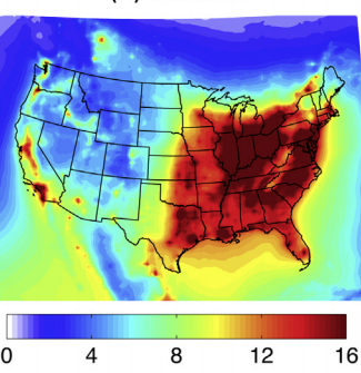
No, almost certainly not. The study that Dr. Gardner cites is incredibly misleading -- and it appears to have been purposefully written that way. Consider the image (on right) depicting PM2.5 (small particle) air pollution in America. California, the Midwest, and the eastern U.S. look terrible.
But here's the catch: Look at the scale. According to it, the worst air in America contains 16 micrograms (μg) of small particles per cubic meter of air (m3). The World Health Organization's PM2.5 standard is an annual average of 10 μg/m3. The study's own data show that air quality for roughly half the U.S. meets the health standard set by the WHO, while air quality for the other half exceeds it, but just barely. The only reason this map looks bad is because the authors deceptively colored it with ominous shades of red to make it look as if air quality in America is unhealthy.
And it's not even clear that the map is accurate. It does not agree with the PM2.5 air quality map produced by the WHO. (See below. Scale: green < 10 μg/m3 of PM2.5; yellow 11-15; orange 16-25; orange-red 26-35; red 36-69; dark red 70+.)
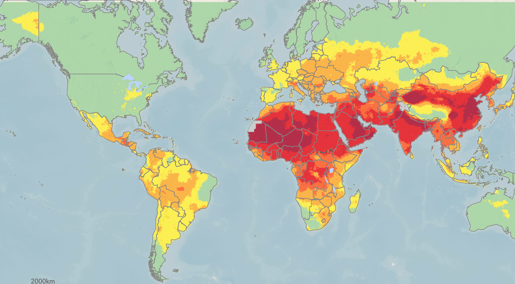
According to the WHO's map, almost all of America's air is perfectly clean. The splotches of yellow, located in the Midwest and California, exceed the WHO standard of 10 μg/m3, again just barely. Indeed, a recent report, which we discussed earlier this month, concluded that the U.S. would receive little health benefit from cleaning up its air even further: One and half months of extra lifespan per person.
So, how is the figure of "200,000 premature deaths" determined? It seems to be based on an EPA report that assumes there is no safety threshold for levels of PM2.5:
"[B]ased on a subsequent re‐assessment of the scientific literature and consultation with the public and outside experts, EPA returned to the earlier practice of estimating benefits down to the lowest measured fine particle concentrations without imposing an assumed threshold."
In other words, the EPA consulted with environmentalists and activists, then decided to endorse the most alarmist possible interpretation of the data. If there is a single particle in the air, you're going to suffer an early death. That's the pollution equivalent of telling mothers they're going to poison their babies if they have a glass of wine while pregnant.
Can the U.S. Learn from China about Air Pollution?
Dr. Gardner is entirely wrong. Not only are his stats based on dubious extrapolations, but his conclusion that the U.S. can learn from China is backward. On air pollution, the Chinese could learn from us.
But when a politically motivated history professor writes about science, anything is possible.

Alex Berezow, PhD
Former Vice President of Scientific Communications
Dr. Alex Berezow is a PhD microbiologist, science writer, and public speaker who specializes in the debunking of junk science for the American Council on Science and Health. He is also a member of the USA Today Board of Contributors and a featured speaker for The Insight Bureau. Formerly, he was the founding editor of RealClearScience.