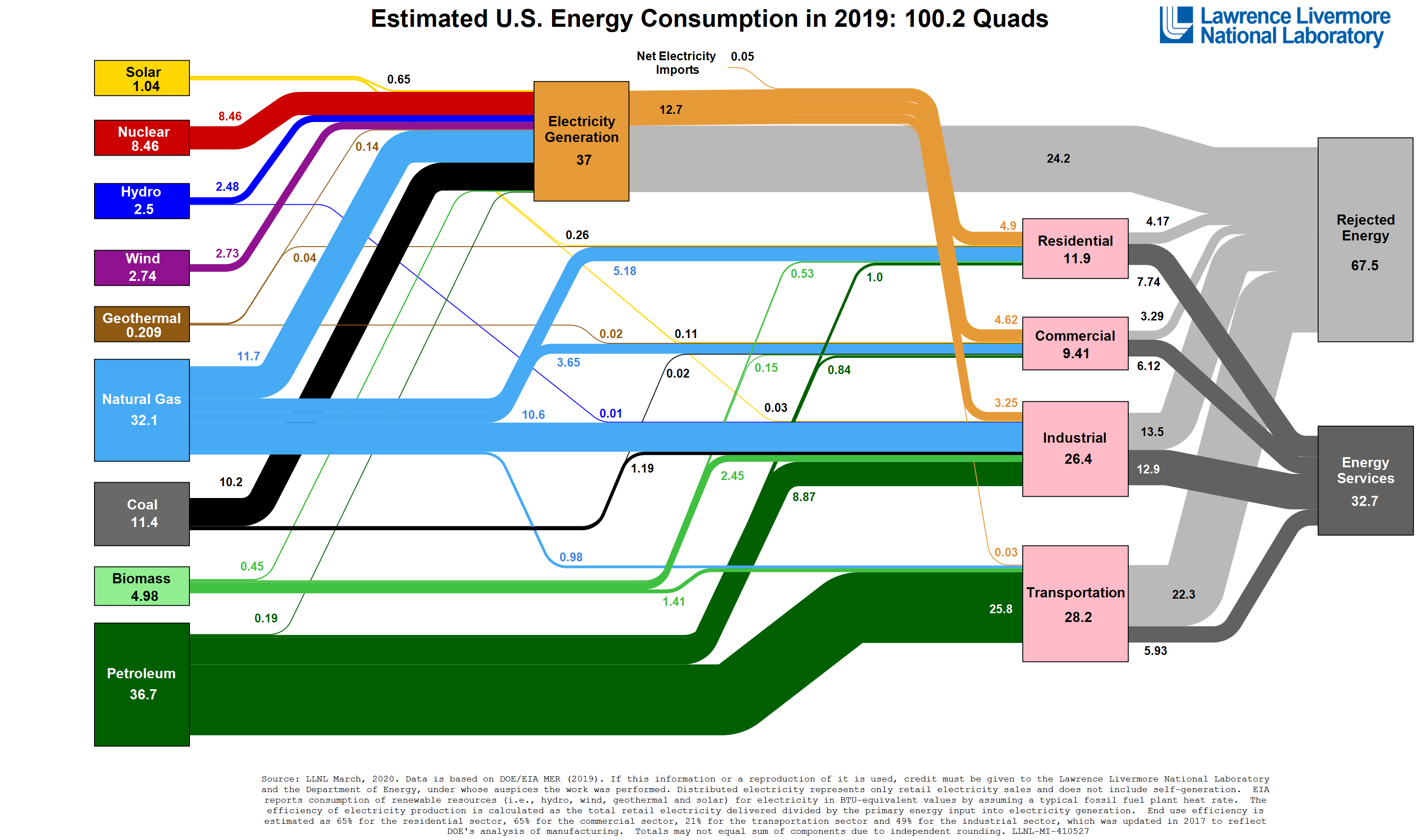
Every year Livermore National Laboratory produces a chart of where our energy comes from and where it goes. The biggest changes, less coal, more natural gas.
First and most importantly a shoutout to Econlife, which drew me to the graphic and is always a source of interesting economic information.
 As the Econlife article mentions, Livermore has produced video to accompany the graph. You can find the video here.
Category

Chuck Dinerstein, MD, MBA
Director of Medicine
Dr. Charles Dinerstein, M.D., MBA, FACS is Director of Medicine at the American Council on Science and Health. He has over 25 years of experience as a vascular surgeon.