
"As the nation reckons with racial injustice, we cannot overlook our health system. Hospital leaders have a responsibility to better serve people of color and create a more equitable future."
Lown President Vikas Saini, MD
To be fair, Lown’s website is not as inflammatory as the Becker quote, referring to “socially responsible hospitals” and health equity. They provide a listing of which hospitals they believe are the most socially responsible by providing the best in health equity, outcomes, and the value of care.
What is health equity?
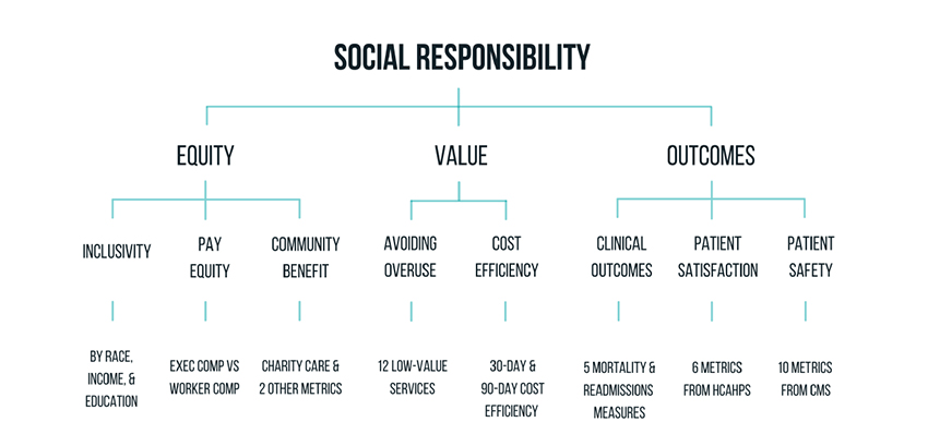
For Lown, the term quantifies three considerations.
- Inclusivity, the proportion of individuals, based upon demographics, within the hospital’s catchment area that the hospital treats.
- Equity of pay measured by the ratio of CEO income to that of the non-professional staff
- Community benefit as measured by charitable care, community investment, and Medicaid revenue.
Inclusivity
How well did hospitals serve their catchment area based upon race, income, and education? While the listing reduced those variables to a single number, Lown reported on their methodology in a MedRxiv article which provides more insight than their aggregate measure.
“Quantile regressions confirmed that the hospital characteristics associated with the highest composite inclusivity scores were metro-area hospitals, major teaching hospitals, and safety-net hospitals, while the characteristics with the lowest inclusivity scores were metro-area hospitals, major teaching hospitals, and non-safety net hospitals.”
That sentence may take a moment to process; the same hospitals that were the most inclusive were also the least. When they looked more closely at those issues, they found that the highest correlation was income and 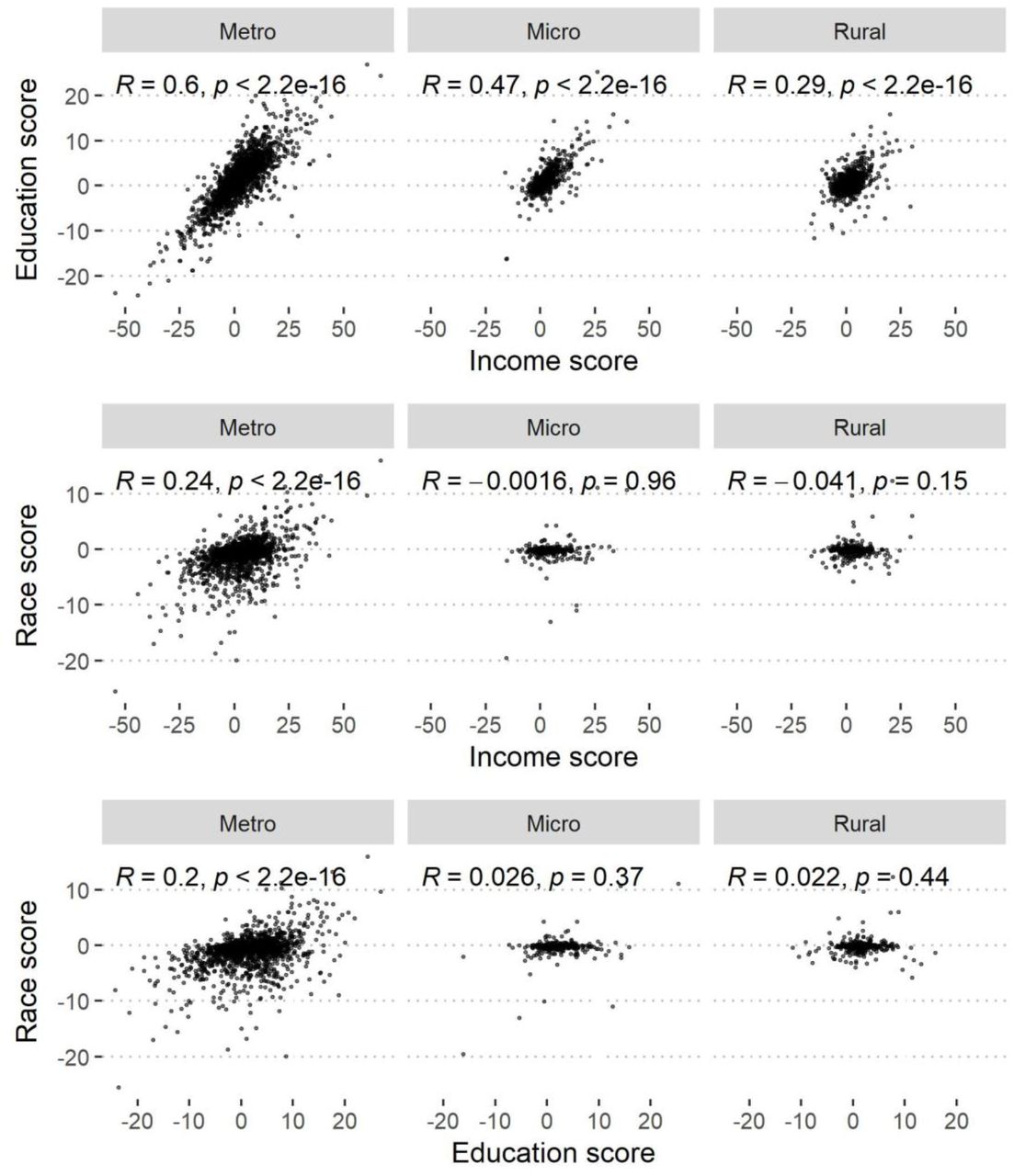 education, not race, in the Metro or metropolitan hospitals. [1] And race played no role at all in those smaller, micro, and rural areas. So, why would education and wealth be factors – what is attracting more wealthy, educated patients to these hospitals than in the surrounding neighborhood. Lown does report limitations in their data, in the MedRxiv paper, not the PR release or the website presentation. Those limitations include the assumption that everyone in the zip code acts in the same way. However, they recognize that “Communities of color and working-class communities may prefer certain hospitals.” The data is solely based on the Medicare population, so how Medicare Advantage and patients with commercial insurance act is unknown. And then, there are “socioeconomic and cultural changes within zip codes, such as gentrification of poorer neighborhoods.”
Consider Mt. Sinai Hospital in New York City, which had a diversity score of 7 out of 100, definitely in the lowest segment. The hospital itself was founded in 1852 to provide
“free medical care for indigent Jews in New York City. In 1855, that vision came to fruition with the establishment of the 45-bed Jews' Hospital in New York.”
The use of the word Jew was and is a dog whistle of sorts.
“The medical staff was primarily Jewish, because until relatively recently, it was difficult for Jewish doctors to obtain postgraduate training or specialist posts at major New York hospitals.”
In any event, the hospital followed its patients and moved to its current location in 1904. Its neighborhood became gentrified, and it is why income and education are more reflected in their patients than is race.
Or consider NYU and Bellevue Hospital. Bellevue is very equitable; Lown calculates a diversity score of 86, NYU Langone, with a score of 1.7, is even lower than Mt. Sinai. Within a block or two of each other, the two hospitals have integrated programs with NYU faculty and trainees (medical students, residents, and fellows) all rotating through Bellevue. Of course, there are differences. Bellevue is a Level 1 trauma center; NYU Langone is not. NYU Langone is a tertiary referral hospital, Bellevue is part of the City’s Health and Hospital Corporation. You would not expect NYU Langone to necessarily mirror the surrounding demographics because, by its nature, it pulls patients from throughout their network that require tertiary rather than routine care. None of this is factored into Lown’s calculations.
Does Good Value include Outcomes?
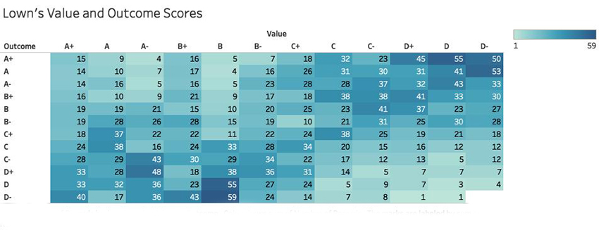 This represents the hospital’s value and outcomes as calculated by Lown and is taken directly from their freely available dataset. The darker blue represents a greater number of hospitals which is also labeled. The vertical access are Lown’s grades for patient outcomes; the horizontal axis is their value metric.
Take a look at those 273 hospitals in the A+ value column. 104, a little more than a third have the lowest possible patient outcomes, D- to D+. Do these really represent value? Or that last column, the 304 hospitals in the D- value column, how could 44% of those hospitals with A- to A+ patient outcomes have done so wrong to be rated as having so little value?
Pay Equity
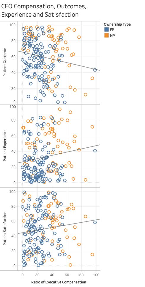 You would think that the payment to be the CEO of a hospital would somehow involve the patients' outcomes, experience, and satisfaction. Lown determined its “Equitable pay” metric as the ratio of CEO salary to that of the average non-professional working in the hospital. The data is somewhat uncertain because not all CEO salaries are publicized, and staff income can only be approximated from national values. Apply as many grains of salt as you wish.
Again, using Lown’s data, I graphed executive compensation against patient outcomes, experience, and satisfaction. The horizontal scale shows an increasing ratio for CEO salary, i.e., greater payments. The vertical axis shows the three patient variables. The straight lines are the trends.
As CEO salary rises, patient outcomes get worse. But all is not lost; the patients surviving all are more satisfied and feel they had a good experience.
Finally, just a reminder. Non-profit is a tax status, not a measure of profitability or payments. Just for fun, here is the breakout of executive compensation ratios for non-profit and for-profit hospitals. The graphs is a box and whiskers plot. The box shows the values in their compensation between the 25th and 75th percentile with the line in the box, the median. Executives at for-profit hospitals earn a median 20 times more than their average worker; 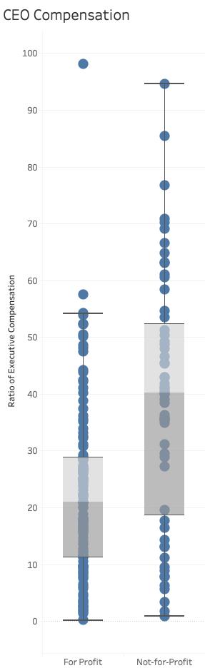 at the non-profits, that doubles to 40 times.
The Lown Institute is right in wondering about the disparities in care associated with our hospitals and health systems. But I think I have demonstrated that the metrics are flawed. There may well be differences in patients being treated at a facility compared to those living around the hospital, but the underlying reasons are more nuanced than simply pointing to racial inequity. And how can a hospital be felt to be an A+ value when it has D outcomes? The Lown Institute’s annual measurement of equity and disparity needs to be significantly rethought. In the meantime, it does a disservice to the health systems that care for anyone who walks through their doors.
[1] Those R values give the degree of correlation; an R of 1 is essentially a 1:1 correspondence, an R of 0 is no correlation at all.

Chuck Dinerstein, MD, MBA
Director of Medicine
Dr. Charles Dinerstein, M.D., MBA, FACS is Director of Medicine at the American Council on Science and Health. He has over 25 years of experience as a vascular surgeon.