
Why do some physicians have better outcomes and spend less than others? If only we knew the answer, then everyone could have better care at less expense – the holy grail of production efficiency. We have already discussed studies attributing part of that “secret sauce” to gender; a new study looks at where a physician went to medical school, stratifying the schools based on that “signal of provider quality,” the rankings published by US News and World Report.
If you follow this genre of research, you already know the basics. Data was taken from Medicare payment data from 2011 to 2015, 996,000 admissions to hospital involving 30,000 physicians. The outcomes were death at 30 days, readmissions within 30 days, and spending on physicians for the hospitalization. Despite hospital care being team based, the results were again attributed to either the physician who charged the most during the care, typically 51% of the bill, or the physician actually admitting the patient. They used emergency admissions in an attempt to “minimize patient-physician selection by either physicians or patients and restricted the specialty to general internists.
Physicians were matched with the medical schools they graduated from and the ranking of those schools by US News and World Report (USNWR). To those late to the party, USNWR uses the school's reputation, research activity, student selectivity, and faculty resources – data blending peer assessment, acceptance rates, and other numbers, in a delightfully weighted ranking. Studies have demonstrated that these rankings are remarkable stable year-to-year; another way of saying that they rarely change and that the good get better and the bad not as much. (Bad is probably too strong a word, [SPOILER ALERT] there are no bad medical schools as we are about to see).
- About 13% of their physician sample went to one of the top 20 medical schools, ranked based on their primary care or research.
- Patients had similar co-morbidities and diseases between the physician from the best and those from the rest.
- 30-day mortality was no different between the groups
- 30-day readmissions were slightly less from the best, 0.4% better.
- Physician costs were slightly less from the best, $36 on the best of days or about a 3.5% decrease
- Rankings based on a school’s “social mission score” or by their NIH founding resulted in no difference in outcomes or costs.
In looking for that secret sauce to training the perfect physician, the researchers thought that perhaps national standards were stringent enough to ensure competence and that all medical schools, irrespective of whether they wanted to train clinicians or scientist-clinicians, graduated competent clinicians. They acknowledged that perhaps a different phase of physician education, e.g., residency and fellowship might account for greater differences. In their primary findings, the researchers compared physicians working at the same hospital, when they looked at physician’s outcomes without matching for hospital, physicians from the best had greater lower 30-day mortality, 30-day readmission, and costs – where you practice, who you practice with, how the ecology of that very local health system supports you makes a more significant difference. Unfortunately, from my view, the researchers attributed this to the selection of physicians hired by the hospital rather than the environment the hospital provided. Finally, they thought that the USNWR rankings might not actually be a signal of quality, something anyone in medicine knows and that marketing ignores.
You do not learn how to be a doctor in medical school; you learn vocabulary words, normal and abnormal physiology and how we classify, diagnose and treat. But you learn how to be a physician in those post-graduate years, residency and especially fellowships. If you are looking for a possible cause of variation, look there. But what is very clear, at least to me, is that in the team activity we call hospital care, the ecology of the hospital plays a significant role; perhaps lifting those who need more support.
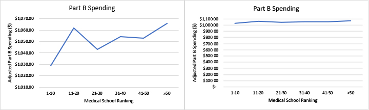
One last thought, the chart on the left is taken from the paper itself, it violates a basic tenet of data presentation, it dost not display the zero origins of the vertical axis; the graph to its right presents the same data with a zero origin. What a difference in the visual impression of the data, one shows a trend upwards, another a flat line. Why would the British Medical Journal print such a pretty, but misleading graphic? What are their standards for graphical information?
Source: Association between physician US News and World Report medical school ranking and patient outcomes and cost of care: observational study BMJ DOI: 10.1136/bmj.k3640

Chuck Dinerstein, MD, MBA
Director of Medicine
Dr. Charles Dinerstein, M.D., MBA, FACS is Director of Medicine at the American Council on Science and Health. He has over 25 years of experience as a vascular surgeon.