
The tracker I am using is Our World In Data. More specifically, the section on the US States, based upon the CDC vaccine tracker. Before jumping in, let's start by quickly discussing reliability. Unlike the early COVID-19 disease data, the data on vaccinations is closely monitored from distribution to individual arms. Any of you lucky enough to have been or are scheduled for vaccination know that you are required to provide information, which is the basis of these reports.
Some, sort of, good news
The US has administered more vaccines than any other country, 12 million. China is right behind with 10 million, and Israel, the current exemplar of a good vaccination program, 2.7 million. That number, doses administered, doesn't provide context; you need a denominator that allows for comparison. As will be valid for each of these metrics, a denominator of the population will improve your understanding and make comparisons more useful. Here is the vaccine administered by country.
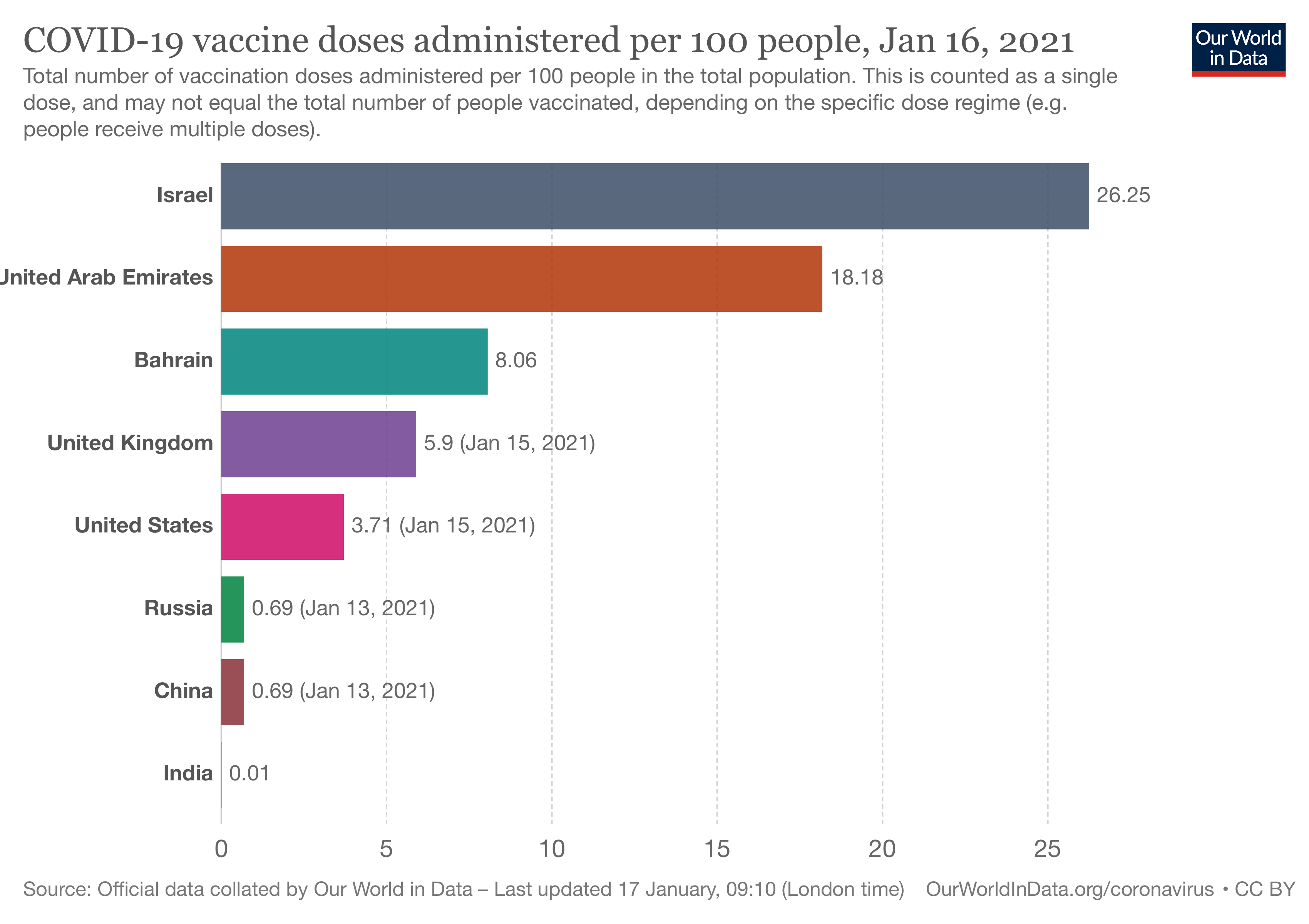 We have vaccinated roughly 4% of our population, six-fold less than Israel but six-fold better than China. India's vaccination rate is currently a disaster. We will need all of these numbers to rise if we are to re-establish free travel and commerce. In the meantime, let's be a bit more focused on what is happening here, at home.
On to the US
Here is the same data for the top and bottom three states and our five most populated ones. (California, Florida, New York, Pennsylvania, and Texas)
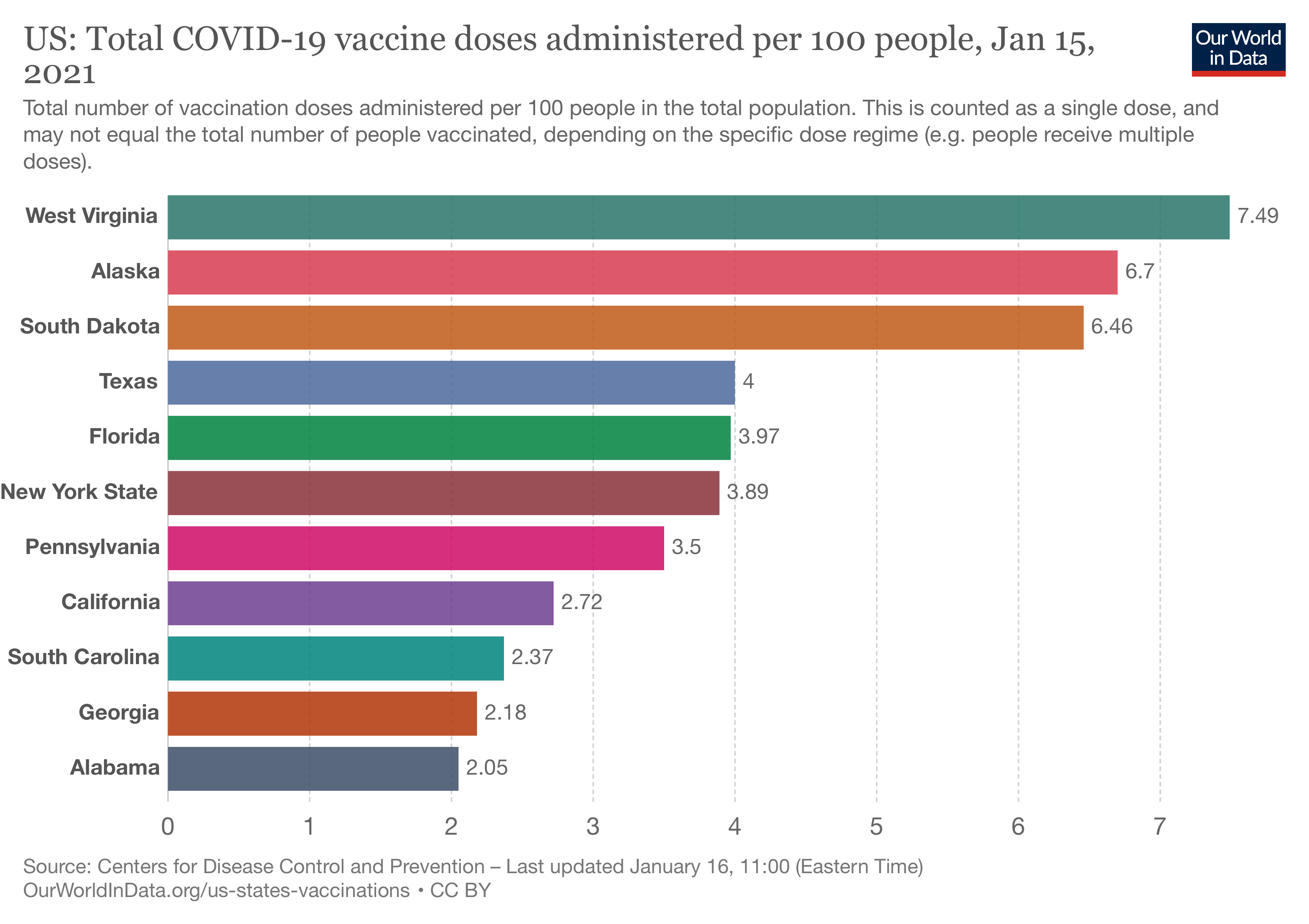 West Virginia, which is currently getting a lot of press about its success, leads the pack, but Alaska and South Dakota are no slackers. Among the largest states, California seems to be struggling the most. If your state is not listed, I encourage you to visit Our World in Data's website.
Herd-Immunity
There are several ways to look at vaccination progress, but the real goal is herd immunity. That immunity is a combination of those who have experienced COVID-19 and the vaccinated. With 24 million accumulated cases and 400,000 deaths, we can ballpark those with immunity acquired from the disease at, say, 20 million. That number will continue to rise but hopefully will only contribute 10 or 15% to our herd immunity over time. The vaccinated contribute to herd immunity once they have received both doses. This metric will lag behind measures of initial doses and be hidden in metrics of doses given. Once again, the absolute number is not as pertinent as the number per some measure of population. In this instance, it is a % of the state's total population.
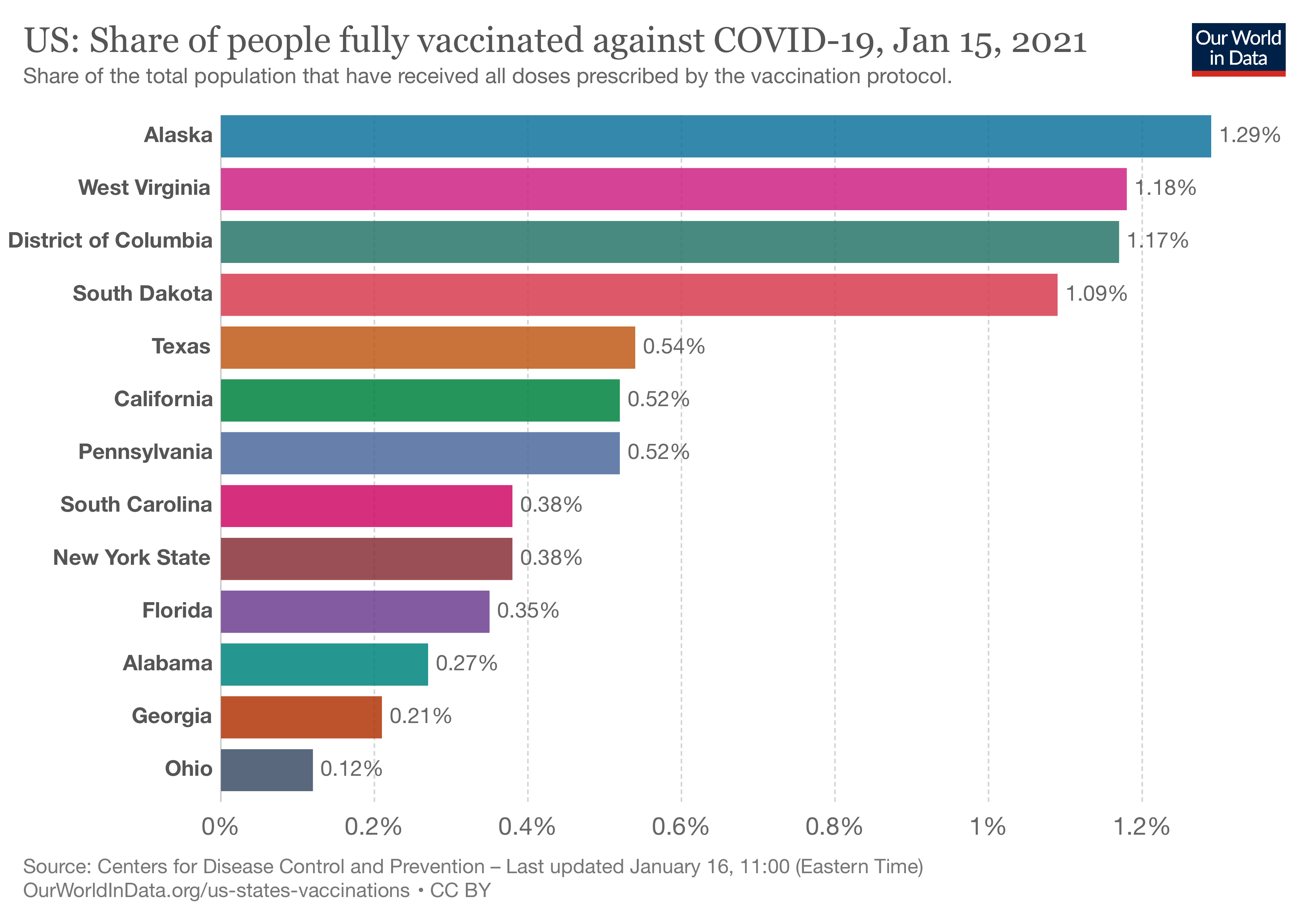
The District of Columbia has made it up into the top three, Ohio has joined the bottom three. Among the most populous states, you can see that while California gave out fewer doses overall, those doses went to immunize individuals fully. The exact percentage necessary for herd immunity is unknown and widely discussed, but this metric will tell you how close to whatever number you choose. I'm going to go with 80%, at least for the moment.
Operational Efficiency
Given all of the problems with the initial roll-out of vaccinations, we need to see some vaccination measures over time. Daily vaccinations may vary widely, based on hours of operation, day of the week, etc. So these swings are smoothed, reducing highs and lows by calculating a seven-day average.
 Arkansas seems to be getting its act together, Missouri, Main, and Alabama, not so much.
This number's value helps us see how we are doing in meeting that goal of herd immunity or the current target set at vaccinating 1,000,000 people a day. To meet the target of 1,000,000 vaccinations a day, the rate needs to be 0.28 or higher. To meet the target of one million fully vaccinated people a day, the rate must double to 0.56, a value which we should see after 3-4 weeks. [1] The current US national average is 0.30, so the goal of 0.56 is achievable. At that rate, we will be fully vaccinated next year. Want to enjoy the spring? We need to quadruple that number. Maybe mid-summer is more realistic?
Another metric to currently consider, from that operational perspective, is whether vaccinations are increasing. As we expand our capacity to vaccinate, we want to see rising rates as more people go through the system than the day before. We want to continue to see this metric, the change in the daily rate of vaccination, rise until it reaches that 0.56 value or higher nationally. We could consider absolute change, how many more vaccinations than yesterday, or relative change, the percentage increased from yesterday. Both have value; I am going with absolute. You should take this chart with a grain of salt, as it shows those smooth averages for the last three days. I would expect dramatic changes in the next few weeks
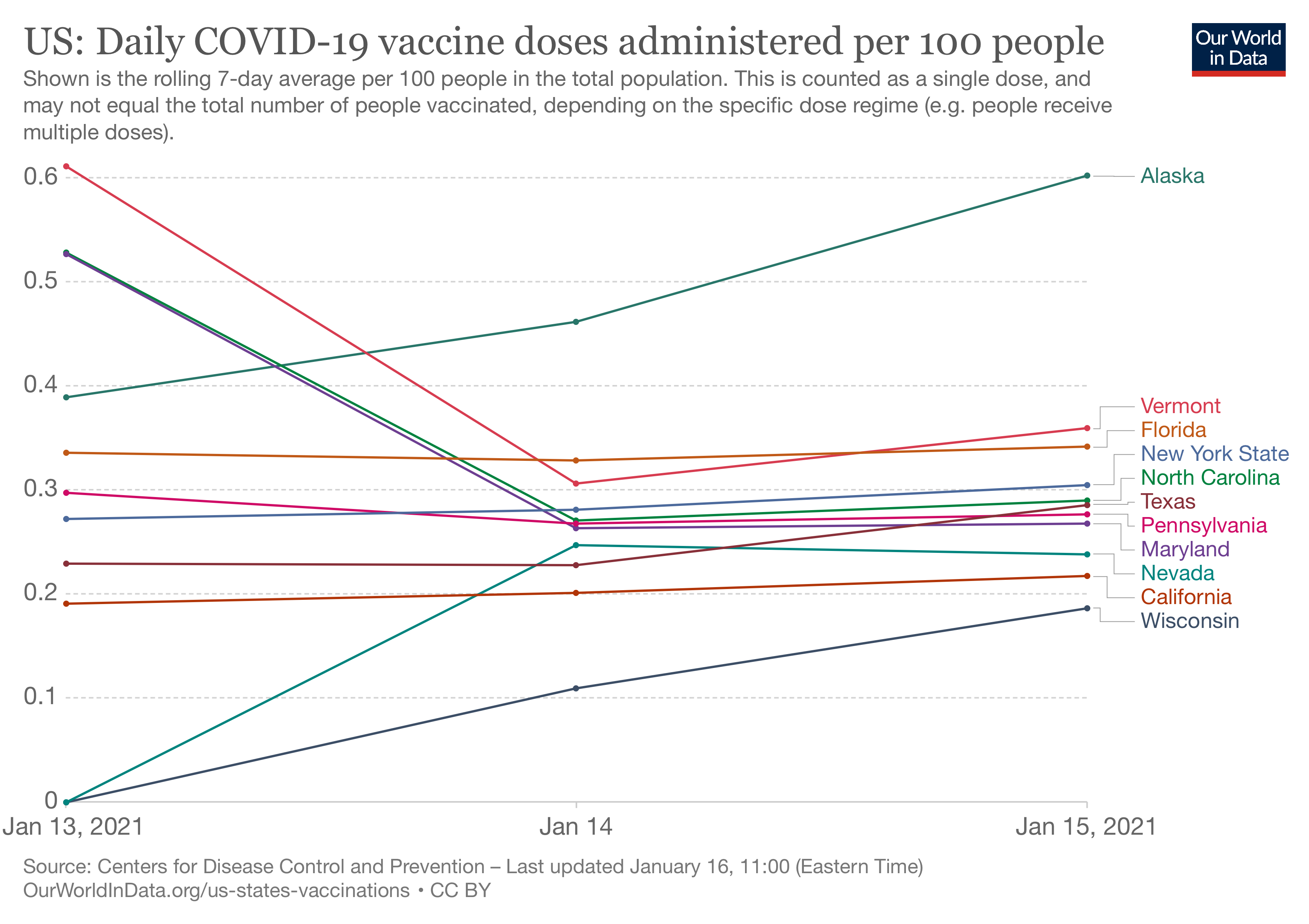 The chart is visually confusing. Three states are improving Alaska, Wisconsin, and hidden in the pile Nevada. Several states are having an off-day, including Vermont, Maryland, and North Carolina. The trend in most populous states is essentially flat. From an operational perspective, they are working at their current capacity; whether that capacity is limited by vaccine, vaccination sites, or vaccinating staff is unknown.
The media is reporting a great deal of information on how much vaccine is being used. It is the easiest to understand of all the operational metrics, but it tells us very little about where the problems lie. The federal government is currently distributing vaccine based upon population. Vaccination used really tells you how well the federal government is matching the vaccination capacity of the states. Higher utilization may reflect more efficiency of vaccination, which we want, or inadequate allotment, which we do not.
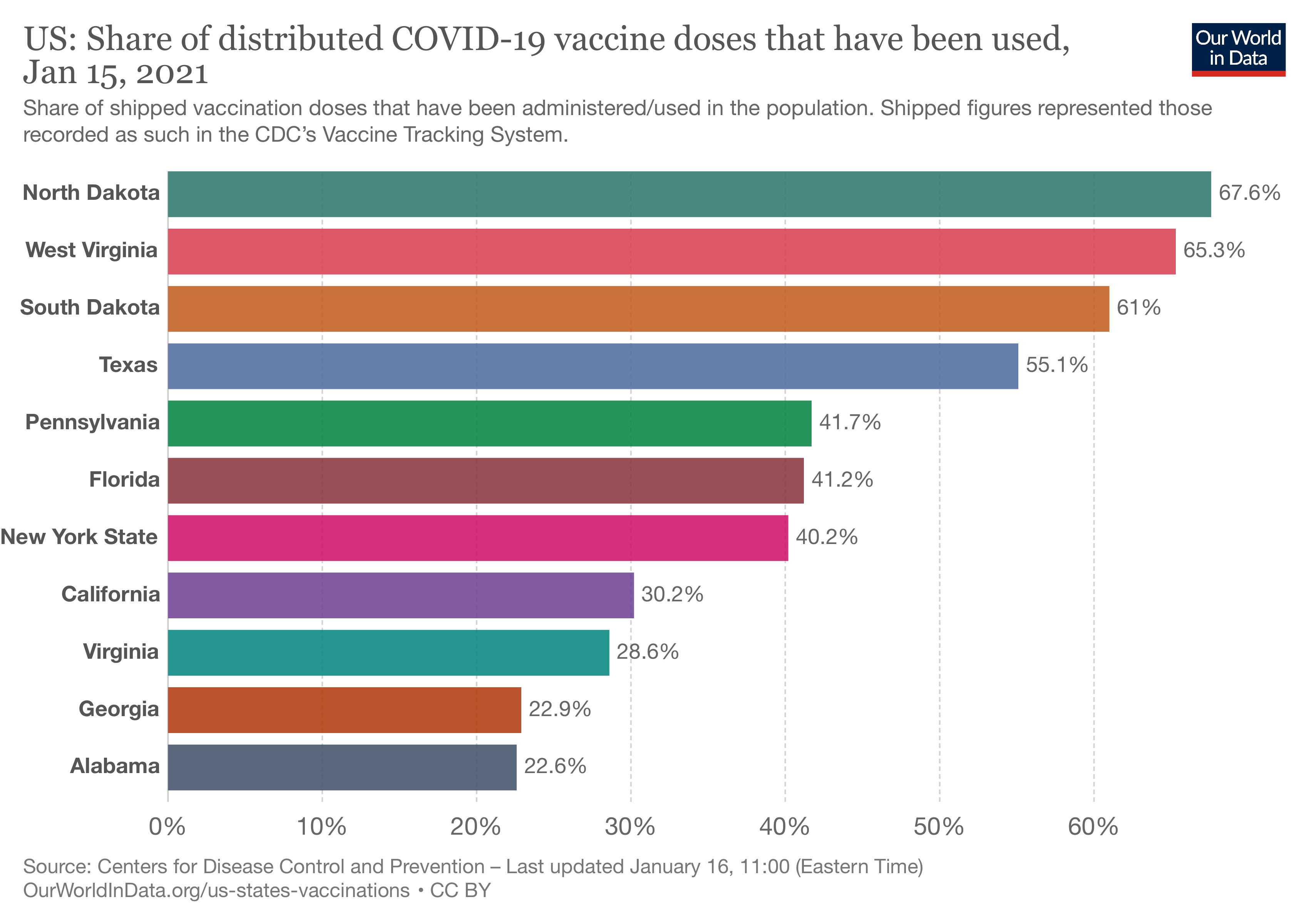 There is a three-fold variation from lowest to highest. Expect these percentages to change as capacity is built out, and communication in the allotment is improved. Production of vaccines is not the issue currently. It may become so later on.
A Final Thought
I want to mention one other group, those in long-term care – our most vulnerable and those supposed to be vaccinated first. Currently, only 26% of the shipped doses have been used in this population. This disparity speaks to the problem of lining people up in the queue. The decisions by states to widen the eligibility to reduce "unused" vaccines are misguided. Instead of increasing movement through the system as measured by daily vaccinations or the rate of increased daily vaccinations, they have merely increased the input to the system. All this has done is to increase people's frustration and needlessly stressed computer systems unable to handle their current capacity effectively.
These five graphs provide a good summary of how we are doing. We will revisit them over the next few weeks.
[1] Suppose you vaccinate one million people a day. In that case, they must return in 3-4 weeks for their second dose, so on day 31, you need to vaccinate that one million receiving their second dose along with another one million receiving their first dose. That 0.56 rate drop as we complete vaccinations and fewer and fewer people require their first dose.

Chuck Dinerstein, MD, MBA
Director of Medicine
Dr. Charles Dinerstein, M.D., MBA, FACS is Director of Medicine at the American Council on Science and Health. He has over 25 years of experience as a vascular surgeon.