
Temporal trends
There are large swings in case rates (up to 100-fold) but smaller swings for deaths (~15-fold). There are two major peaks in cases and deaths but many more in case fatality ratios (CFRs). [1]
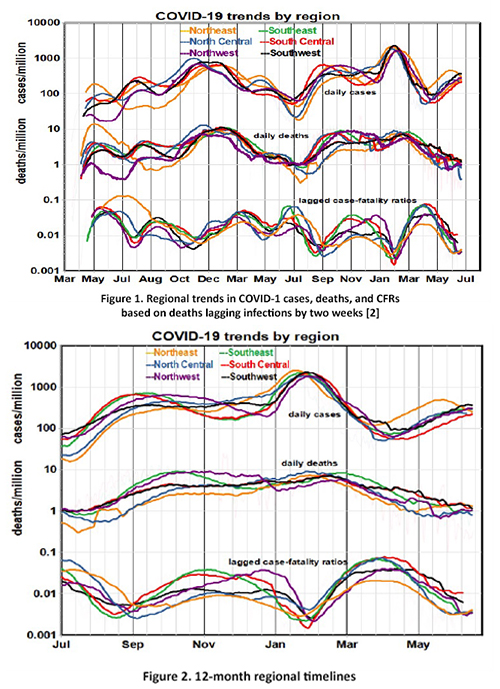
The six regions follow parallel but inconsistent paths, effectively ruling out stable geographic factors like population density or political preferences as primary causal factors.
Focusing on the past 12-month trends doesn’t help much. Regional differences diminished, and case rates reached new peaks in February in all regions, despite prior vaccination programs. Temporal presentations treat elapsed time as the primary variable, consider cases and` deaths separately, and look for regional gradients.
Would a different visualization yield other insights?
Another approach
We postulated a “mortality model” that neglects temporal sequences and predicts death rate as a function of case rate, which is now the primary variable. We assume that each death was preceded by a case (infection) and seek to understand the relationships between cases and deaths for a given distribution of cases. The slope of deaths vs. cases expresses the lethality of disease across the population, as opposed to the probability of an infected individual’s death.
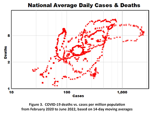
We plotted 14-day national moving averages comprising about 800 data points, ignoring variations among regions (Figure 3). This graph looks less like 2+ years of scientific data than a Rorschach-like outline of a large bird with a hole in its middle trying to take flight [3]. But is there a message in there for us to see?
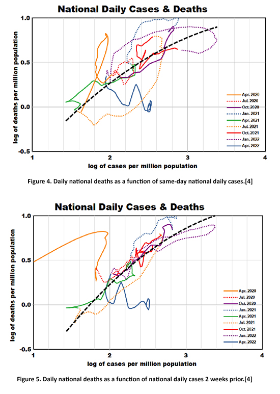 Noticing some chain-like sequences, we then re-introduced temporal variation, color coding sequential 3-month segments from the pandemic's beginning to the present (Figure 4). We fit a smoothed non-linear curve through these data, shown by the dashed black line, with a statistically significant correlation coefficient of 0.66.
Two new insights are apparent:
- The shape of this relationship indicates that higher infection rates were less lethal.
- There was a steep mortality trend at the beginning of the pandemic, which has recently leveled off.
Lag effects
The media tends to ignore the lag between cases and deaths, often reporting, “COVID-19 rates have increased (or decreased) but deaths have not.” Our answer would be: “Just wait and see!” We replotted Figure 4 assuming lags of 1 – 4 weeks and found that longer lags improved the precision of the trend line. We chose the 2-week lag to conform with our previous analyses (Figure 5).
The statistical improvement is noticeable (correlation coefficient of 0.83), and all temporal segments conform to the curve-fit except the first and the last. The intervals plotted can be related to some key events of the pandemic.
- January 2020: infections of the Alpha variant began on the East Coast and spread rapidly. (solid orange line)
- January 2021: nationwide deployment of the original 2-shot vaccination program began, and the Delta variant appeared and spread rapidly. (dotted blue line)
- October 2021: the first booster vaccination program began. (solid red line)
- December 2021: the Omicron variant appeared and spread rapidly. (dotted red line)
- April 2022: the second booster vaccination program began. (solid blue line)
At the pandemic's beginning, the death-case relationship was extremely sensitive to lag, and case-fatality rates were higher, perhaps because the medical system was ill-prepared for the unprecedented demands. Currently, lagged death rates are essentially independent of cases and are relatively flat even though case rates continue to increase. The most notable excursions in excess deaths were at the beginning of the pandemic (April 2020) and in January 2021.
Summary
This mortality model does not attempt to explain the distributions of COVID-19 cases, which depend on the interplay of exposure with the immunity resulting from vaccination or prior infection. Instead, it focuses on the most severe consequences of infection, i.e., mortality. We found that seven of the nine 3-month periods of the pandemic conformed with a simple non-linear relationship between the logarithms of cases and subsequent deaths 2-4 weeks later with a correlation of over 80%, regardless of infection provenance. These results also imply that the death lag was shorter in the early days of the pandemic than it is now, presumably because of improved medical treatments.
Whether the present situation will continue remains unknown. Nevertheless, we must realize that the current mortality rate of 1 per million per day sums to 120,000 deaths per year, which is the 8th leading cause of death and more than double the annual toll from influenza and pneumonia.
The current data suggest that our current COVID-19 status bears little resemblance to where we’ve been.
[1] We used logarithmic scales to directly compare cases and deaths, and population-based rates to compare the six regions.
[2] https://github.com/nytimes/covid-19-data
[3] Herrmann Rorschach was a Swiss psychoanalyst who devised a graphic test for patterns of thought in 1921 using “inkblots.” Patients were shown inkblot illustrations and asked to describe their thoughts about them, even though there was no underlying meaning. Such responses might indicate personality disorders like depression or hostility, and Rorschach tests have generated more publications over time than any other psychoanalytic method.
[4] These figures are plotted as logarithms to accommodate curve fitting. The actual x-coordinates are 10, 100, 1000, and 10,000 cases per million. The actual y-coordinates are 0.32, 1, 3.2, and 10 deaths per million.