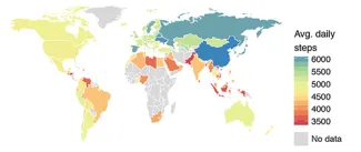
A recent issue of Nature featured an article entitled Large-scale physical activity data reveal worldwide activity inequality. I admit two things drew me to the article, the data, and the term inequality. First, let’s consider how and what they found. Rather than relying on self-reported estimates or wearable sensors, the data, on walking, was derived from the pedometers (actually accelerometers) found in smartphones. Your iPhone can indeed be used for research. The researchers made use of data from an iPhone app, that recorded the user’s footsteps along with their self-reported gender, age, height, and weight. Their location by country or city was determined from the location of their IP address (in the case of a country) or by noting the cell phone tower location that upgraded their weather feed (in the U.S., city locations were also identified). The data collected over an 18 month period for 717,527 people representing 68 million days of physical activity. They found:
- Activity inequality is associated with higher obesity levels and was a better predictor of obesity prevalence than the “average volume of steps recorded.”
- In countries with high activity inequality, activity was reduced disproportionately for women than men.
- Lower activity is associated with substantial increases in obesity; there is little change in the prevalence of obesity among high activity individuals.
- Using the city location data, the researchers found that the more walkable [1] the city (for example, our home base New York City) the lower the activity inequality. The walkability increased physical activity during both work and leisure.
Interesting information and the finding concerning walkability and activity is a strong suggestion that our environment can impact our health in subtle ways. Acknowledged study limitations included a bias toward higher income individuals and countries (after all, who own smartphones?) and that activity other than steps were not considered.
All of that was good and useful if you understand the term activity inequality. Inequality. That has a pejorative meaning; I have more you have less. So, what exactly does the term mean? Well, the short answer is that inequality is a statistical description of variance within a distribution. It is an effort to show how the variance in the data surrounds the mean; is more of the variance at one end or another, or scattered throughout? A large variance in how variation surrounds the mean indicates greater inequality. They characterize and quantify the variance using a Gini coefficient [2] “that is the most commonly used measure with which to quantify inequality and statistical dispersion.” A value of 0 indicates total equality, no dispersion, a value of 1 shows near complete inequality or dispersion. So I must confess, I was wrong (did I just say that?) in assuming that inequality was pejorative, it is simply a technical term at least statistically speaking. An additional bonus learning point from having read the study.
[1] Walkability is a way of measuring how friendly the neighborhood is to walking around. The scores used in the study are “based on the distance to amenities such as grocery stores, schools, parks, libraries, restaurants, and coffee shops.” The algorithm developed by a company called Walk Score, “awards maximum points to amenities within 5 minutes' walk (.25 mi), and a decay function assigns points for amenities up to 30 minutes away.”
[2] The Gini coefficient is most directly determined by knowing what proportion of a population has a given proportion of entire populations “resources.” So if 20% of the population walks 90% of the steps, the Gini coefficient is .7 [.90-.20 = .70] Using the oft quoted statistics on Medicare, when 5% of recipients are responsible for 50% of the costs, the Gini coefficient would be 0.45.

Chuck Dinerstein, MD, MBA
Director of Medicine
Dr. Charles Dinerstein, M.D., MBA, FACS is Director of Medicine at the American Council on Science and Health. He has over 25 years of experience as a vascular surgeon.