
The graph shows "averaged" statewide averages of cumulative deaths per million residents by region. Three features stand out:
- the steep early rise in the Northeast to which New York City was a major contributor
- the more recent increasing trends in the South
- the parallel but widely separated trends in the North
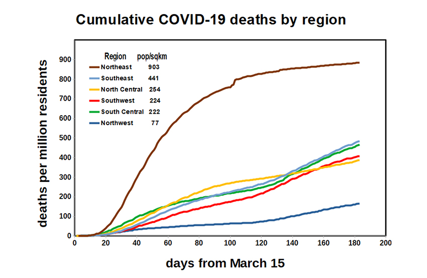 The Northeast suffered from being first and overwhelmed – those early deaths remain reflected in the cumulative totals. Masking and social distancing kicked in by early summer. Midsummer saw premature lifting and widespread flouting of exposure restrictions in the South – as those three widely separated southern regions show a rise in deaths at about Day 120.
Trends are roughly parallel in the three northern regions, but cumulative deaths doubled from Northwest to North Central and again to Northeast. The Northeast is the most crowded region of the country, the northwest the least. The estimated urban population densities (listed on the graph) increase about 5-fold in each case.
The message is clear; COVID-19's mortality is related to our crowding and behavior. Not all of us can change our geography. What to do if you live in a high population density? Wear your mask and avoid crowds.