
In our studies, we present COVID-19 findings in terms of counts per million population; to convert, it is easy to remember that the U.S. population is about 330 million, New York City comprises 8 million, and the smallest states about half a million.
Long-term trends.

The pandemic began in the Northeast when public health agencies were largely unprepared, leading to surges in cases and deaths. Cases increased in the other regions at similar rates from June to August and from October to December; corresponding rates of decrease were similar. Considerable regional variations persisted from August to December in most of the regions. Overall, the Northeast trends were the most varied, having the highest case and death rates in the spring followed by the lowest in the summer and fall. By contrast, Northwest trends shifted higher in the fall.
Case-fatality rates (deaths/cases) reflect the severity of exposure, patient resilience such as age and comorbidity, and the adequacy of medical care, lagging about 14 days from infection. CFR’s reflect the basic wave patterns, oscillating by an order of magnitude in all six regions between spring and late fall. Infection rates may be moderated by social distancing and face masks, but subsequent mortality is largely beyond the patient's control.
The July-October period affords an example. Case rates decreased in August, presumably as a result of individual exposure avoidance. However, mortality rates remained remarkably steady through October, leading to increases in CFRs by a factor of 5. This was also the case in winter. Such large swings in national health statistics are quite remarkable.
Recent trends.
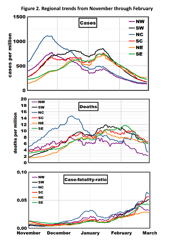
We then took a closer look at the past few months using actual rates rather than their logarithms (Figure 2). Wide variations among regions persisted until mid-January: cases ranging from 400 to 800 per million and deaths from 6 to 12 per million. Case rates fell by a factor of 4 from their winter peaks, but death rates dropped by only a factor of 2. As a result, CFRs began a significant ominous upswing.
What’s next?
Case rates are currently leveling off but at rates substantially higher than last spring. What happens next? Another cycle, perhaps peaking in April? Reduction of the baseline and descent to the levels of the pandemic beginning? Continuation of the current limbo-like plateau? While it is necessary to describe these trends and regional differences as a first step, understanding them remains elusive.