
The Omicron variant appeared in December 2021, and the 2nd booster vaccination program began in April 2022, but outcome trends were essentially unaffected. [1]
 The distribution of cases is a complex function of the properties of the virus and its variants, exposure, and protection by vaccination or natural immunity. An inability to rationalize the temporal patterns led us to postulate a “mortality model,” abandoning attempts to explain the patterns in infection rates and focusing on its consequences, specifically deaths. Our previous modeling focused on national data; here, we extended the analysis to six regions within the nation. We made scatterplots of the 7-day moving averages of daily deaths against the 7-day moving averages of daily cases 2 weeks previous, fitting a quadratic smoothing curve for each region. [2] We then were able to visualize spatial variability over the entire pandemic.
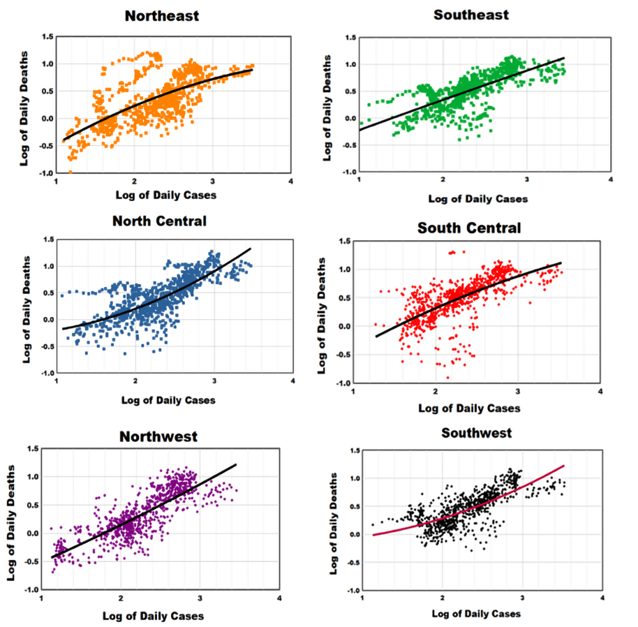
These scatterplots are similar in their overall presentations but with some departures.
- The Northeast has a group of days with ~10-fold death rates higher than their corresponding modest case rates, but the NE death rates are generally lower than in other regions.
- The North Central region has a similar group of days with high death and low case rates.
- The Northwest region has no such anomalies; just quasi-random scatter about the trend line.
- There is a group of days with anomalous low death rates at modest case rates in the Southeast and South Central regions, somewhat less so in the Southwest.
- The ranges of these 7-day averages are from about 0.2 to 16 deaths per million and about 10 to 3000 cases per million population.
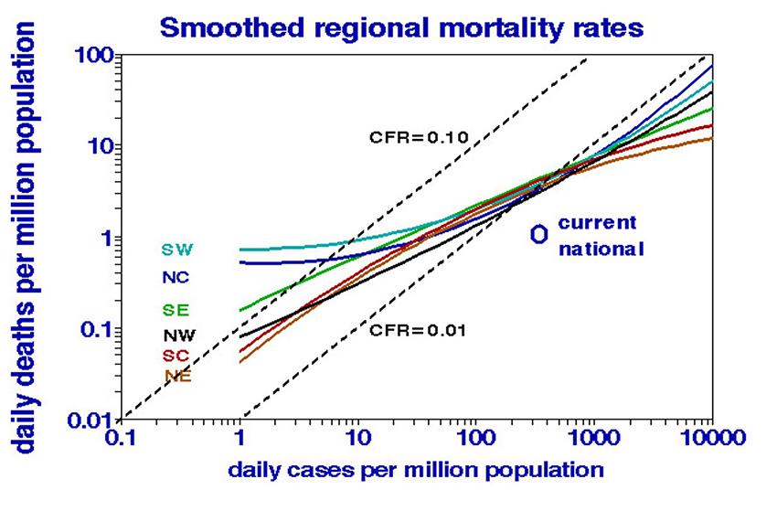
We summarized the overall trends by superimposing those regional trend lines in a joint presentation.
- High case rates tend to be less lethal and vice versa.
- There are essentially no regional differences in case-fatality rates (1%) at case rates from about 100 to 2000 daily cases per million population.
- Southeast death rates tend to be higher, and Northeast rates are lower at both extremes of the case rates.
- The extrapolated trend lines indicate that national daily COVID-19 death counts are unlikely to exceed about 10,000 or get much lower than 30.
Our time-line plots typically show cyclical variations in outcomes with no hints of causality, but mortality modeling shows systematic nonlinear effects of infection rate. At the low infection rates typical of the onset of the pandemic, 10% of cases died within two weeks, especially in the North Central and Southwest regions. More recently, cases seemed to be considerably less lethal with the Omicron variant and more frequent testing. The current case fatality rate is only about 0.3%. Indicating that the national COVID-19 situation is better than we might have expected from the long-term averages. Nevertheless, beating the pandemic depends on continuing to reduce exposure.
The case-fatality rate is a measure of disease severity and can be used to evaluate the effect of new treatments such as vaccinations.
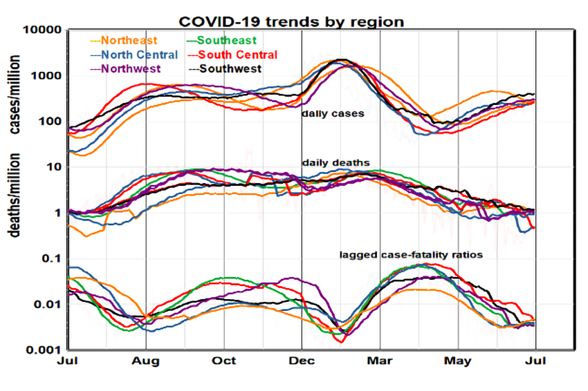
[1] We used logarithmic scales to facilitate direct comparisons of these trends.
[2] Scatterplots of daily data are more granular than regional trend lines, better-displaying anomalies.