
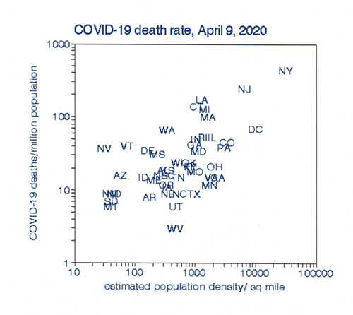
To answer this question for myself, I focused on data from the N.Y. Times for each state because it’s much easier to understand data among 50 states than 3115 counties, most of which had no COVID-19 cases. I used cumulative deaths per million population for this analysis. The distributions of these statewide data comprise the spatial trends. Changes in these distributions show temporal patterns, hence “space-time.” Because graphical presentation aids in discerning the overall picture, I chose the estimated urban population density for each state as a plotting parameter.
This plot shows the distribution of COVID-19 deaths by population density. New York State has the highest death rate as well as the densest population, primarily because of New York City. The western mountain states have the opposite. There is a clear relationship with population density that is statistically significant and consistent with the belief that there is higher virus transmission in more crowded situations.
 I then repeated this procedure for April 22, May 4, and May 16, allowing time to visualize temporal changes. These results also showed scatter, perhaps because of various uncertainties in death counts, but they also showed a similar relationship with population density and suggested a curvilinear relationship with density. I evaluated this possibility by fitting a quadratic relationship for
 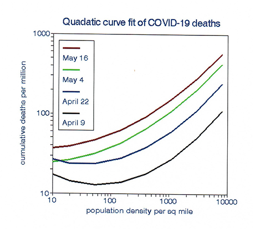 each period that confirmed this supposition and fit the data slightly better. The plots indicate an inflection point at approximately 100 persons per square mile, suggesting no relationship among the sparsely populated states. However, the quadratic form is just as arbitrary as a linear relationship and represents the analyst’s judgment, rather than the story contained in the data.
I then smoothed the data in order of population density to suppress random variation that may have obscured relationships among the sparsely populated states. This technique is often used to analyze daily time series data in terms of averages over several days rather than each day, the so-called “running average.” Here I used sequences of states over space rather than time, assuming that COVID-19 deaths in each state are independent of those in its neighboring states.
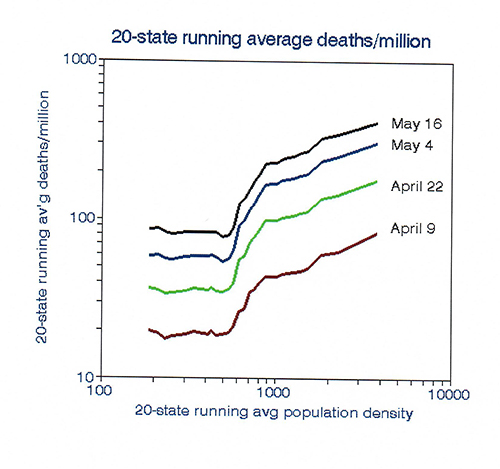 The results based on 20-state running averages show an inflection point primarily due to data from Connecticut, which has a medium population density but higher than expected mortality rates, perhaps because of commuters to New York City. The data clearly fall into three groups: no trend in population densities less than an average of 600 per square mile, a transitional group, and a 1: 1 (log) linear relationship in the more densely populated states [1].
This procedure does indeed tell a different story than can be obtained from tabulated death counts. It helps us understand state-level variations in COVID-19 death rates and their changes as the pan-epidemic progresses.
I concluded that:
- Population density does not impact COVID-19 infectivity in the sparsely populated states but is associated with mortality in the denser states.
- Grouping states by population density remains valid over time and may provide a rationale for re-opening businesses and schools by region.
- If these temporal trends persist, the low-death states will tend to catch up with the higher death rate states, thus “flattening” the population density effect.
[1] Those states are C.A., CO, IL. L.A., MA, MI, MN, NJ, NY, OH, PA, RI, and D.C.