
The basic COVID-19 disease metrics are cases (positive tests, interpreted as infections) and deaths (death certificates). The headlines on cable news are usually national totals: 30+ million cases and 560,000+ deaths. The media invariably discusses daily new cases or deaths, often locally, that may be difficult to place in context. The ratio of deaths to cases, the “case-fatality ratio” (CFR), measures the severity of infections or the medical system's capability to handle them but is rarely mentioned in the media.
This chart presents this information on a national scale. We use a 14-day moving averaging to “smooth out” anomalous data, presumably from errors or lapses in recording. Contrary to some media graphics, we use a logarithmic scale here, consistent with the exponential nature of an epidemic.
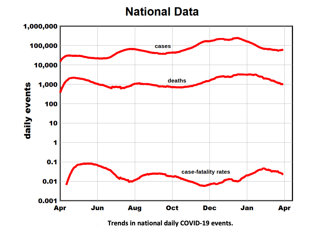
- Note the near-parallel trends for cases and deaths, where deaths tend to lag cases by a few weeks.
- The extensive range in these metrics is also remarkable: an order of magnitude for cases, just slightly less for deaths. This results in a CFR a range of about a factor of 15.
- CFRs may reflect age distributions since younger people tend to weather a COVID-19 infection better, with lower death rates. However, it is unlikely that national numbers reflect age-related “bias,” suggesting that differences in infected patients' care might be significant.
The log scale is also helpful in comparing rates of change. The figure shows three temporal “waves”: initial, mid-summer, and winter. The initially high acceleration in death rates indicates doubling about every 3rd day, presumably because hospitals were overwhelmed by the unanticipated surge in cases, consistent with the high CFRs. After midsummer, the acceleration in case rates slowed, doubling in about three weeks. The corresponding death rates increased somewhat more slowly.
The fluctuation in CFRs is also cyclical, with similar rises and falls for the three waves, suggesting variability in treatment efficacy during the pandemic. These fluctuations in CFRs should be of concern to public health officials.
These temporal changes appear to have dynamic origins.
- Different variants of the coronavirus have been discovered more recently, but it seems appropriate to assume that the disease's underlying source may have been constant until about January.
- Population and physical characteristics such as density would also have been constant, leaving human behavior relative to exposure as a likely source of this variability. Because these human factors are likely to vary across the nation, we stratified the data by region [2].
- We used linear scales to better distinguish among regions, normalizing regional data to account for their differing populations.
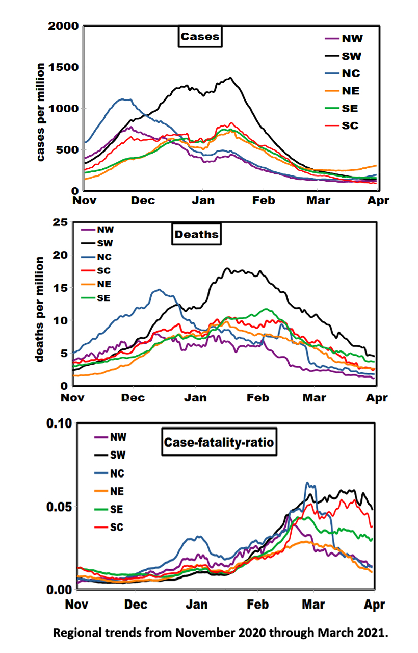
The first impression is one of similar trends in the rates of cases and deaths until about February. Subsequently, case trends coalesced into three groups:
- Northeast and North Central case rates diverged from the plateau and ticked upward at month’s end, suggesting that further increases may lie ahead.
- The Southeast-Northeast-South Central grouping shows remarkable homogeneity, given its geographic diversity.
- Geographic trends in death rates are more diverse; an uptick in the Northeast and North Central regions had not yet appeared, reflecting the expected lag relationship.
- Regional variations in the lagged CFRs are quite different from cases and deaths, with the lowest values consistently around 1% (North Central, Northeast) and higher values of about 5% in the Southwest. CFR can be elevated by either low case or high death rates; the latter appears to be the case in March. It remains to be seen if this situation persists through April.
[1] Regional definitions
Southeast: Alabama, Arkansas, Florida, Georgia, Kentucky, Maryland, Mississippi, Tennessee, Virginia, West Virginia, North Carolina, South Carolina, District of Columbia.
Northeast: Connecticut, Delaware, Maine, Massachusetts, Pennsylvania, Rhode Island, Vermont, New Hampshire, New Jersey, New York.
South Central: Kansas, Louisiana, Missouri, Oklahoma, Texas.
Southwest: Arizona, California, Colorado, Utah, New Mexico, Nevada.
Northwest: Montana, Oregon, Washington, Wyoming, Idaho.
North Central: Illinois, Indiana, Iowa, Michigan, Minnesota, Nebraska, Ohio, Wisconsin, North Dakota, South Dakota.